# Components
Components are reusable blocks that help to create and manage recurring layouts more efficiently across your project. You can create a component from any block, use it on different pages and once you update it on one page, those changes will be propagated automatically to all other cloned instances in other pages. You can use components to create consistent elements like buttons, icons, feature cards or even more complex blocks like footers and headers.
# Create a component
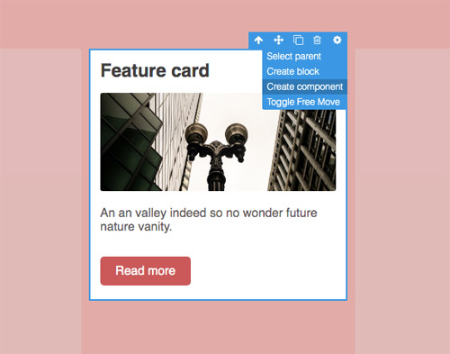
To create a component, select any block in the canvas and click on "Create component" from the setting toolbar button (gear icon).
TIP
You can also create components by using this shortcut ALT + CTRL + K
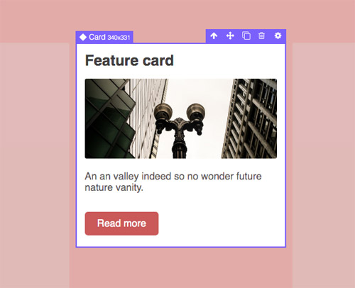
Once the component is created you will notice the update of the block in the canvas and the layers panel.
You will now find your component inside the dedicated Components panel, from which you can already drag and drop other instances of the component in the canvas.
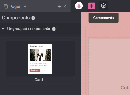
By default, the component is placed in an ungrouped category, you'll see in the next section how to organize better your components.
# Name and organize components
Components can be better organized by following the slash-separated naming convention, where you're free to specify groups separated by slashes, like for example:
My Group/My subgroup/Component name
In order to update the component name, click on the pencil icon near to its name.
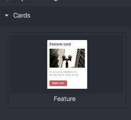
Now change it with the desired name, like Cards/Feature, and you will see the component panel updating with the new structure.
# Using components
To use a component, all you have to do is to drag and drop it into the canvas or simply duplicate ( CTRL + D) one of the instances already in place.
When you add different instances of the same component, those will be always synced structerly when you try to update one of them.
Styles are applied individually on each block of the component, this allows you to differentiate your blocks design but still keeping the same component structure.

In case you need to apply styles from one instance to all others, select "Propagate styles" from the setting toolbar button.
# Nested components
Grapedrop allows you to have nested components with no hassle, all you have to do is to drag one component into another.
# Overridable components
Using consistent components across all your pages is great but sometimes you might need to change some part of the instance without breaking component benefits. In this case you can make any part of the component overridable, this will prevent the propagation of changes to other instances. Select the part you want to make overridable and click on "Make overridable" from the setting toolbar button.
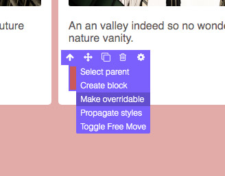
You can recognize an overridable component by its empty diamond icon.
Now, if you try to update the link text or any property from its Block Settings (eg. the target of the link), those won't propogate to other instances and changes in other instances won't update the overridable block.
If you need to undo overridable component, just select it and click on "Undo overridable" from the setting toolbar button.
The great thing about overridable components is the possibility to choose exactly which part of the instance to override. The override will prevent changes on itself but also on the structure of its inner blocks, that means that inner blocks will still remain connected to other instances.
Example of updating/moving overridable blocks inside a connected instance.
Example of updating/moving blocks inside an overridable instance.
# Detach instance from component
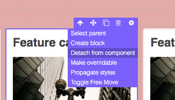
If you need to disconnect one instance from others you can simply detach it from the component by selecting "Detach from component" from the setting toolbar button.
TIP
You can also detach by using this shortcut ⇧ + ALT + CTRL + K
# Delete component
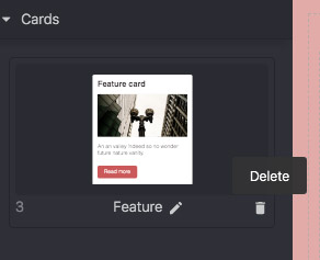
If you need, you can also delete the component from the Components panel, in that case, all the instances will disconnect from each other and will appear as simple blocks.
