# Getting Started
This introductory section guides you through your first experience with Grapedrop. We will start by creating a project from scratch and work up to the online publication of a complete project.
# Preface
The goal of this tutorial is to grasp the basics of the platform, so we will not focus on the design and functionality of the page right now, but will instead focus on the tools that will help you build your next real, production-ready product. The final result of this tutorial will be a landing page for selling a ‘Fitness Lessons’ product, complete with a header, feature section, contact form, and more.
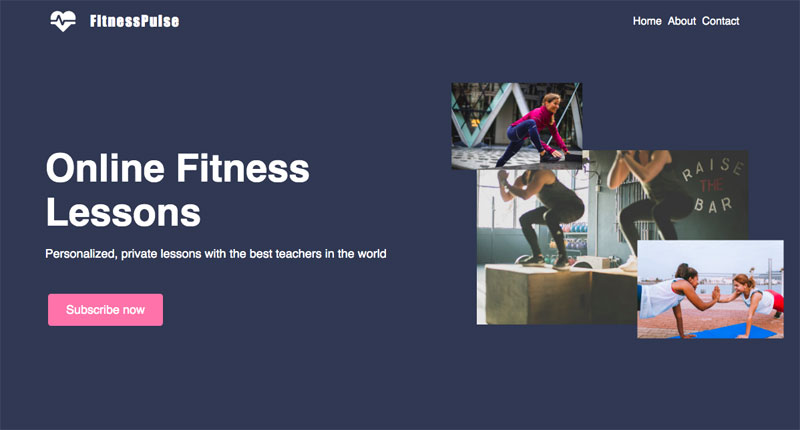
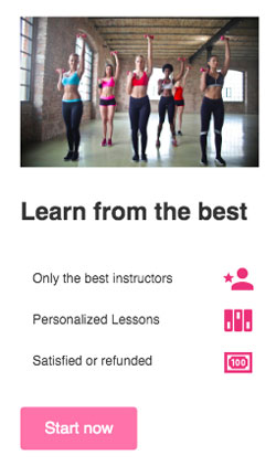
Here you can find the final result of this guide: Getting Started Result
# Creating the project
Once you have created your account and logged in to Grapedrop, we will redirect you to your main dashboard page.
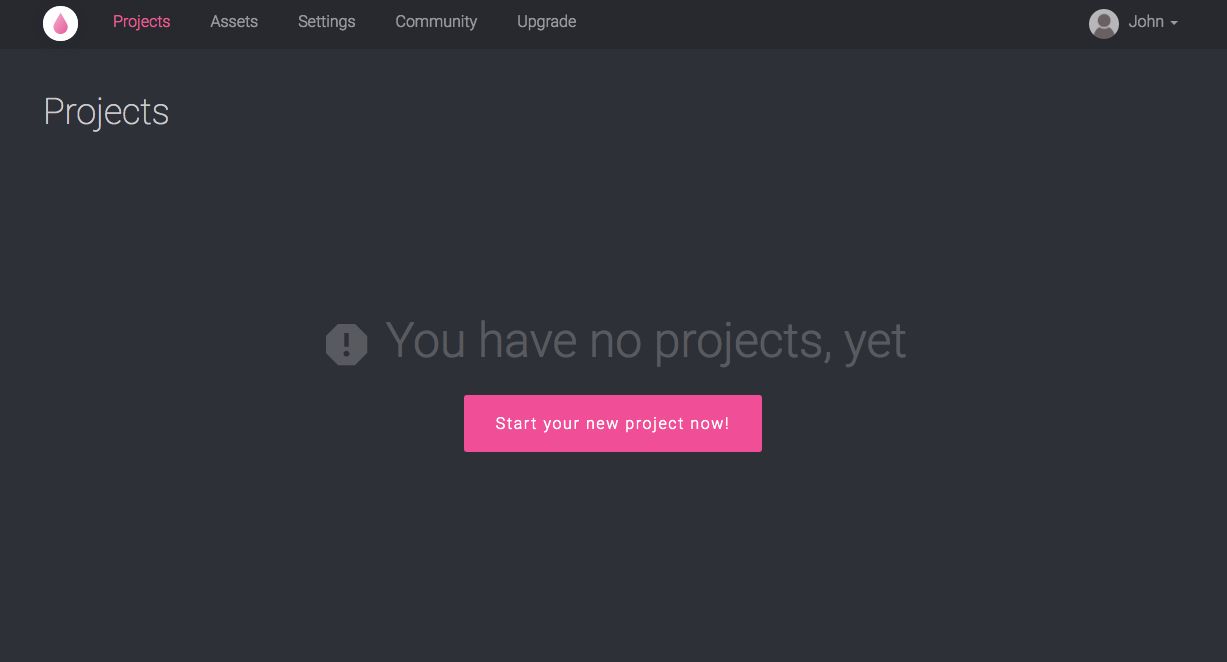
This page is where you manage all of your projects. The page is initially empty and will invite you to create your first project. You can start by clicking on "Start your new project now!"
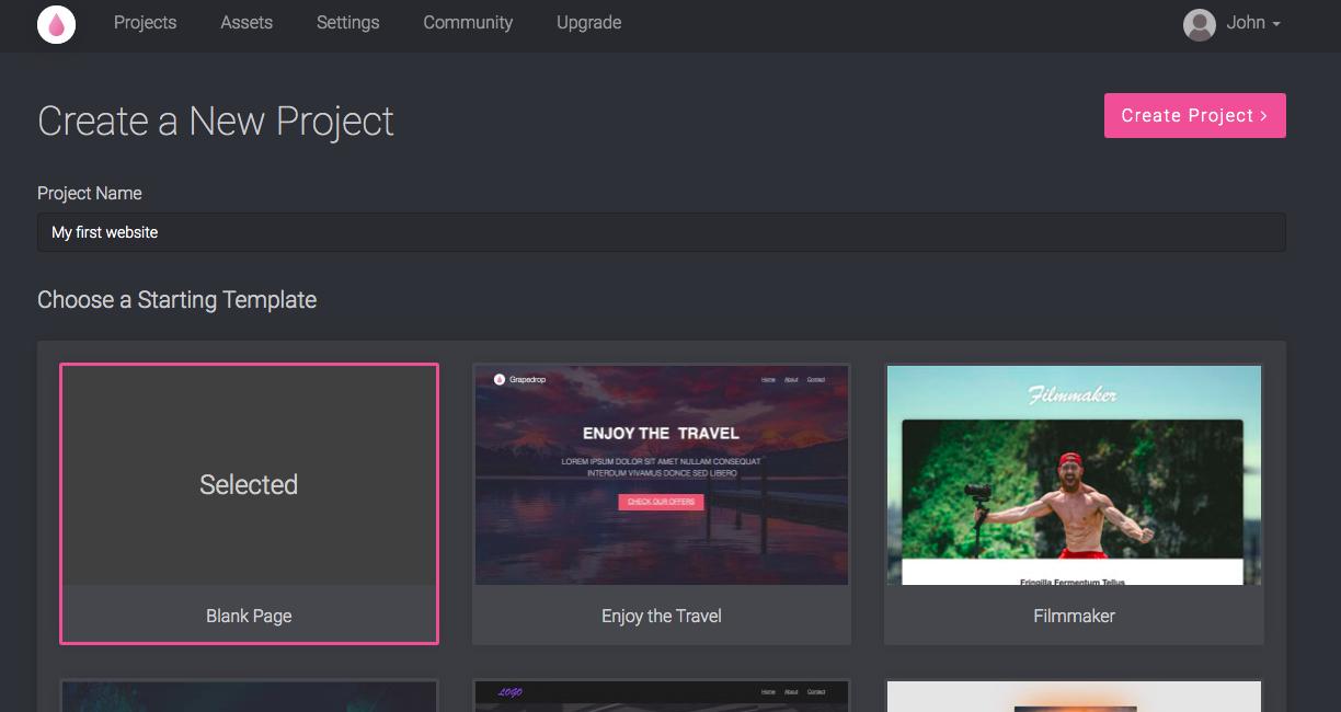
On the next page, decide the name of your project and its starting template. For our purpose, call it "My first website"; and, as you will be creating the site from scratch, select the Blank Page template and click on "Create Project".
# Using the Editor
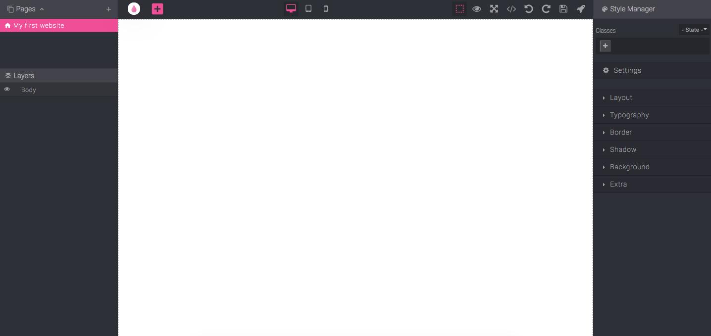
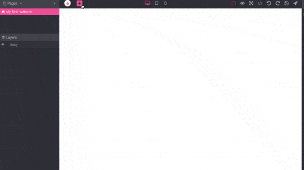
Once you have defined your project, you will redirect to the core of the platform, the editor.
WARNING
For the best editing experience, we highly suggest using, as the browser, the latest Chrome version
The editor has four main sections:
- Canvas - The canvas is the largest and most important section. This where you will see your project take life, by creating layouts with blocks and arranging them via Drag & Drop capability
- Left Sidebar - In this section, you will be able to see the hierarchical structure of your project. On the upper side, you manage the pages, and below, for each of your pages, you can see all the inner layers
- Right Sidebar - The right sidebar is responsible for handling the behavior and styles (the color, background, etc.) of all elements dropped in the canvas
- Topbar - The topbar contains different commands for your project's editing and management
Now we can begin building your website!
# Blocks
Every element dropped in the canvas is referred to as a Block. A block can be a simple element, like an image or text, or it can be a complex combination of other blocks. For this reason, we have split them into different categories. The most important category will be Basic Blocks. Getting a good grasp of how these blocks work is essential for creating and manipulating every other category.
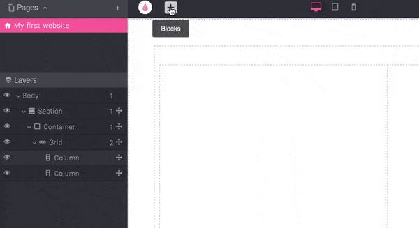
To access all available blocks, just click the big "+" (Plus) button near the Grapedrop logo (a link which brings you back to your project list), and you will see them pop up on the left.
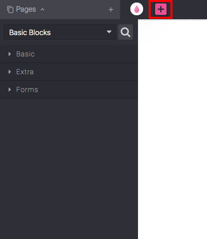
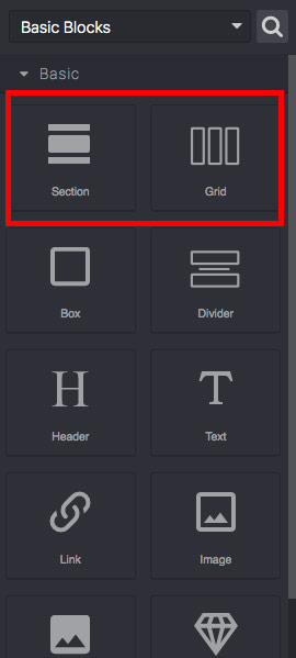
The Basic Blocks category is the default selection and, underneath it, there are sub-categories. For now, we will stick with the Basic one.
Click on the Basic sub-category to show all the available blocks in it. We will focus on two fundamental blocks: Section and Grid.
# Section Block
The Section block is a simple element to use. You can only drop it in the root layer (the Body) of the page. It is not nestable, so you cannot put one Section into another Section. The purpose of this block is to keep your content centred and responsive. All you have to do is drag the element into the canvas and you will see the block's outline.
You can drop whatever you want into the Body — the editor does not limit you. But to keep your content looking good across multiple devices, we highly suggest starting with this block.
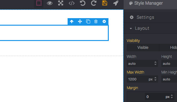
You will see that the Section block has an inner element called Container. The Container is where we drop our content in and is responsible for keeping our content centered. It has a maximum width of 1200px by default, but you can change it if you want your content in a larger container designed for larger screens.
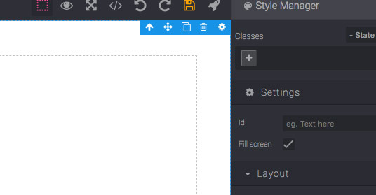
The section we have just dropped will act as the header of our page; for this reason, we need this section to take up all of the space in the window. Now select the section block and, on the left sidebar, under Settings, enable the Fill screen option. The section will now take all the available space.
Now that you have placed a section block, we can start exploring the next suggested block, the Grid block.
# Grid Block
The Grid block is principally responsible for the overall layout of your content, so it is probably the one you will utilize the most. Take your time and get confident using this block, as once you grasp the basics, you can practically build any layout imaginable. To begin, drop one Grid block in our section.
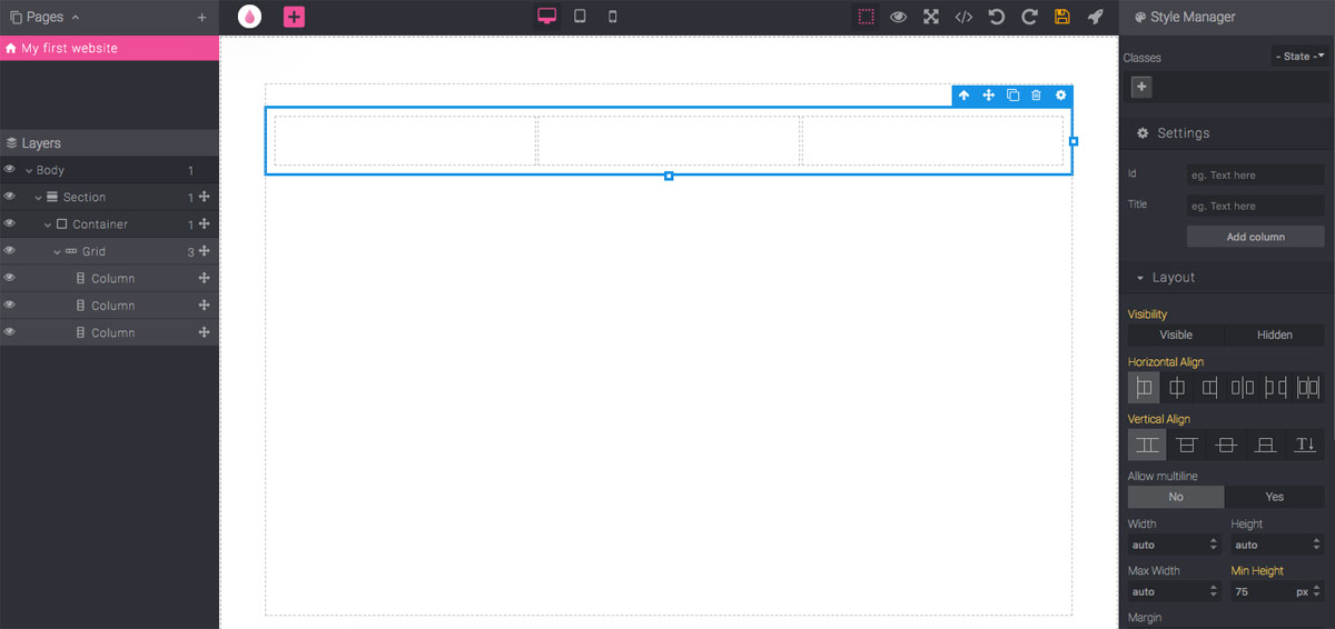
The block is composed of a row element (the Grid itself) and three inner columns. By selecting the grid, you will see in the right sidebar, under Layout, new grid-related properties: Horizontal Align, Vertical Align and Allow multiline. These properties should be fairly self-explanatory and change the behavior of all of the columns accordingly.
You will notice the same when selecting a single column.
The column will also show these properties:
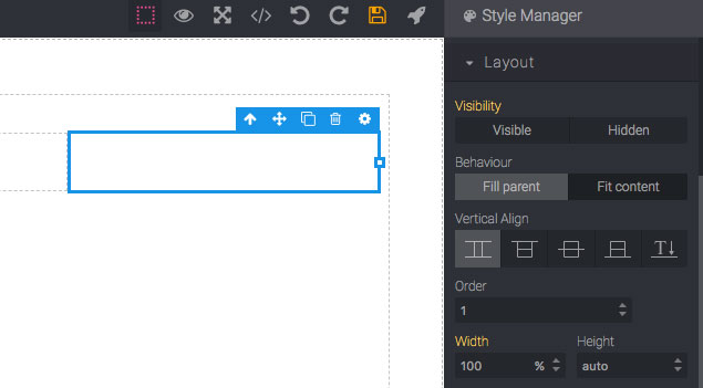
- Behaviour - The Fill parent value is the default. In this instance, the column tries to take all the available space. As we have three identical columns and the multiline (on the grid) is disabled, all of them take an equal amount of space. The Fit content value shrinks the width down to the inner content. While it is empty, the constrict will almost be 0.
- Vertical Align - This changes the vertical alignment of a single column.
- Order - This property can change the order of columns. You can accidentally change the order of columns by dragging them and this alteration in structure will affect the order of columns across all devices. Thus, the real utility of this property is in changing the device view.
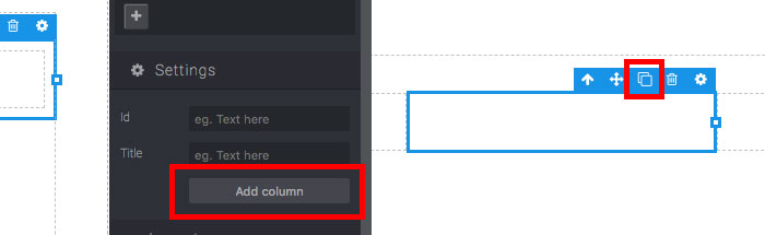
You can add as many columns as you want by selecting the Grid and clicking on the Add column button, under Settings, or by cloning a selected column (via clone action on the block element toolbar or by using CTRL + C/ CTRL + V shortcuts).
To delete columns, just select one and press the ⟵ (Delete) key or via delete action (trash icon) on the block toolbar.
TIP
If you make a mistake, remember you can use these shortcuts:
- CTRL + Z - Undo
- CTRL + ⇧ + Z - Redo
Now let us proceed with the composition of our header.
# Text Blocks
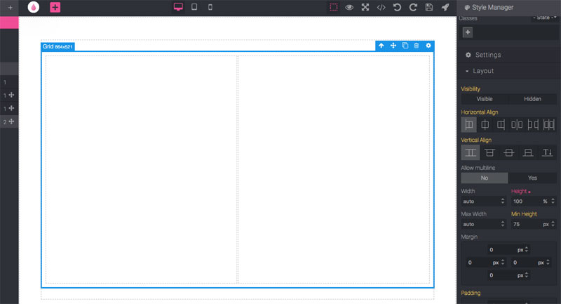
Before adding text content, make the grid fill the height with a value of 100% and delete one of the columns. The result should look something like this:
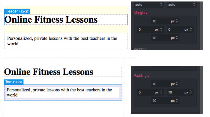
Now drag a Header and a Text block into the left column and update them with some content. To update text blocks, double-click on them to enter into edit mode. Once you have finished, click anywhere outside of the block.
Great! Now you have probably noticed that texts have white space between them. The Header block has default top and bottom margins (outer gaps, highlighted with yellow color on hover). Similarly, the text has paddings (an inner gap, highlighted with blue color on hover) around all its content. When needed, you can quickly adjust them via the Style Manager under the Layout section.
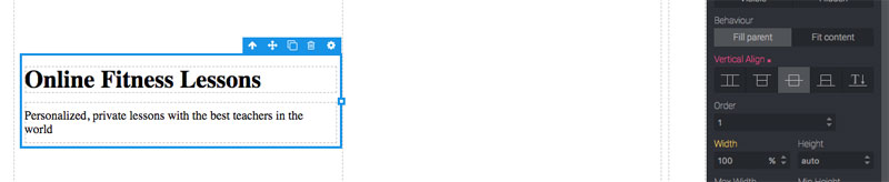
To vertically centre text in the column, you could try playing with margins and padding to achieve this; however, the result will not be very accurate nor scalable (think about updating your content or visualizing your page on different screen sizes). In Grapedrop, when you have layout doubts, try thinking about whether it is something solvable with Grids. Indeed, in this case, all we have to do is use the Vertical align property on the column block, and all our content will be automatically centred.
# Image Block
Now drag an Image block into the right column of our header. Once the block has been dropped, the Image Manager modal window will pop up.
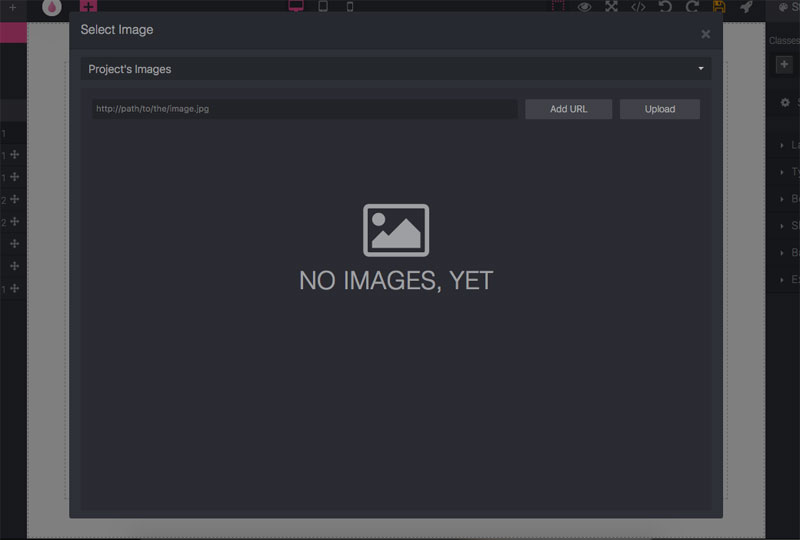
Right now, we do not have an asset uploaded yet, but you can start doing so by clicking on the Upload button. For our example, we are going to use free images from Unsplash. So, switch the value of the select (the one you see on top) with Free Images by Unsplash category, and search for a context-relevant picture.
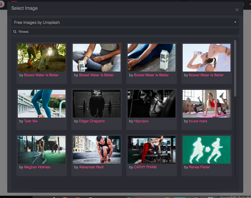
Just double-click on an image you want to select and close the window; then, you will see it on the canvas. If you need to change the image, double-click the block to reopen the Image Manager.
The image will automatically try to fill the available width of the element containing the image, but you can always resize it by using resize handlers.
TIP
By default, when you resize an image, the editor keeps its aspect ratio to avoid a stretching effect. But if you need to ignore it, you can press ⇧ during resizing.
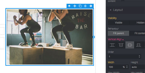
As we did before with text, to centre an image vertically, select the right column, and change the Vertical align property to centre.
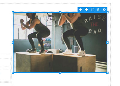
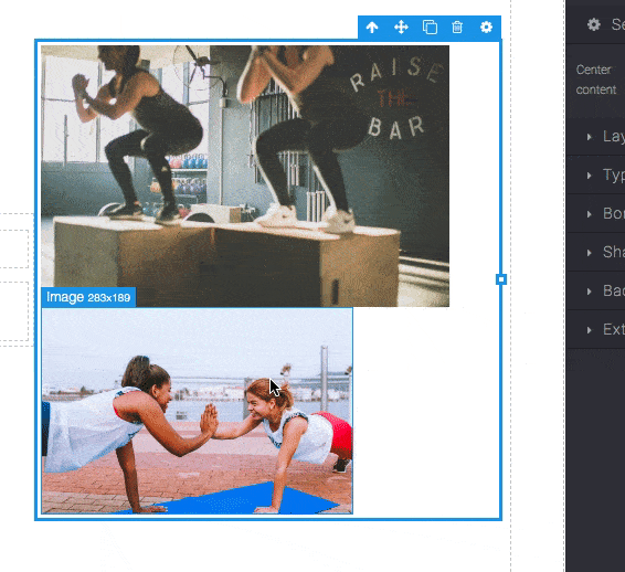
Now, to make things a little bit more interesting, we can resize our image by a few pixels less than its column, drag another image just after the first one, and resize to make it a bit smaller than the first image. The result should look something like this:
The column of the grid tries to adapt itself with the newly added image, but we want to put the first image back to the centre and make the second one float around it.
All we need to do is enable Free Move from the Settings on the block toolbar (gear icon). This action will detach the element from the standard block flow (where the elements are disposed of top-to-bottom and left-to-right) and will allow you to move it freely on the canvas.
WARNING
When the block enters into Free Move mode, it is no longer in the standard flow. However, its movement is still related to its original position. Effectively, this means that if you add a new block near the one moved in Free Move mode, the latter block will likely change its position because you have moved its original position by putting a new element near it. If you want to see an example of this effect, try to resize the first image from the example above.
This appears to be a big flaw. However, this technique actually brings a lot of benefits as it is easier to maintain in a responsive editing context. If you try to move the column containing the images (ex. changing Vertical align to bottom), you will see that the floating image keeps its position. Moreover, the same effect will occur when, on a smaller device, that column will slide down in the document.
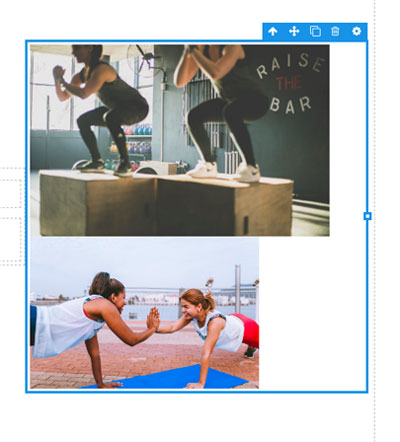
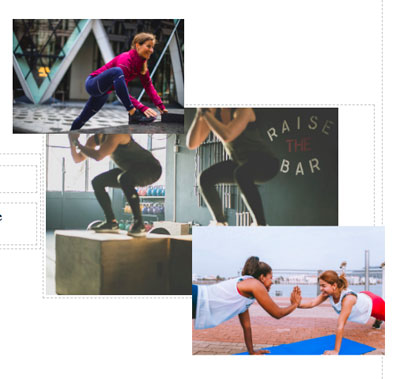
We can also add another image to make it look more symmetrical.
TIP
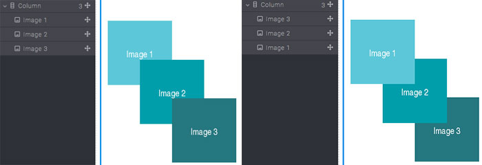
When you see Free Move blocks overlap and you need to change their order, it is easier to re-arrange them in Layers (using the Move icon).
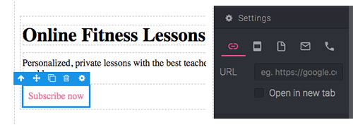
# Link block
To complete the left side of our header, drop a Link block under our text, which will later become a CTA. When you select a link on the right sidebar, you can see all of the available options under Settings.
This block allows for five different types of links:
- URL - Here you can insert any external URL
- Element - Select any element available in the page by inserting its ID (this is useful to point to different sections)
- Page - Points to another page of the project
- Email - Use this to let the user quickly send an email (this will open its default email application)
- Phone - Points to a phone number, which is useful for dialing numbers faster on devices which are able to make phone calls
TIP
The Link block does not accept any other element inside it. However, if you need to apply a link on anything else (ex. an image), you can use the Link Box, which allows you to have the same options as Link, but with the possibility of dropping something else inside it.
Now, what if we would like to center our link in that column? As with many problems, we can solve it by using Grid! Just drop one under the link, move the link into the middle column, change the column Behaviour to Fit content, and you should end up with something like this:

The only problem now is breaking the text. To avoid this, select the link, and, under Typography, choose No for the Line breaking property.
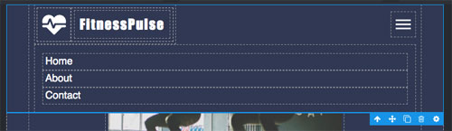
# Navbar block
The final piece of our header will be the top navbar (navigation bar), which will contain the logo of our product and links to different sections of our page. So, drag the Navbar block, this time under the Extra sub-category, on top of our main section.
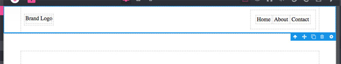
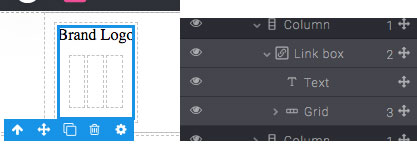
Leave the navigation links alone, for now, and just change the brand logo. Generally, a logo is a single image for the brand/product, but, for the sake of practice, choose a composition that includes an icon and a text. As usual, use a grid to build this composition. Start by dropping a new grid block under the text on the left side of our navbar. As you might need our logo to have a link attached, be sure to drop the logo inside the Link box.
TIP
It may be difficult to move elements into small blocks, so remember, in that case, it is much easier to move elements into the Layers panel (left sidebar).
Drop an Icon block (Basic sub-category) into the left column and, from the icon manager, choose something relevant for our project. In the middle column, drop a simple Text block for the name of the product. You can remove the right column and the text above the grid. If you want, you can also resize the icon and change the text’s styling.

TIP
Too many nested grids may create too much white space around the content. Remember that this can be adjusted by changing the relative margins or paddings under the Layout properties.
Lastly, you may have noticed that the navbar pushed our header section down and that our content is no longer aligned. To adjust this, select the navbar and, under the Settings properties, change its Position to Detached.
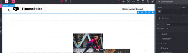
Now that we have a good structure for the main header section, we can start making it more presentable with the Style Manager.
# Styling
Throughout this tutorial, we already made use of the Style Manager. But in this section, we will take a more in-depth look at common style properties.
You may have already noticed that the Style Manager changes its properties based on whichever block is currently selected (ex. grid-related properties under the Layout category). Indeed, each block can have its own set of style properties, which can be manipulated.
Almost all the blocks have this set of styling categories:

But there are some particular cases where this set might differ (ex. the Body block has only Typography and Background).
WARNING
The Settings category, which you can see above the Layout, is a slightly different category. Its primary purpose is to change the behaviour of the block, rather than its appearance. However, the big difference between the Settings category and other categories is that changes to the Settings apply equally on all possible devices while other categories are individually defined for each device.
With all of that out of the way, we can begin styling!
Firstly, select the main section and change its Fill color (under Background) to #303a52 and the Font color (under Typography) to white. As our navbar is not under the same section, the font color did not change, so update its Font color with the same value.
Generally, we suggest changing the main typography properties like Font, Font Size, and Color directly on the Body block as it will apply to all of its inner children (elements within elements). So, select the Body and change the Font to Helvetica, Font size to 16px, and Color to #333 (currently not visible as our section and navbar elements have a different Color).
Additionally, you can make the heading text more visible by changing the Font size to 64px. For the text below the heading, change its Font size to 20px. Finally, for the navigation links, change the Font size to 18px.
TIP
You can preview your page in another tab by clicking on the Preview command.

Great! It is beginning to take shape. Now, we can focus on the CTA button and adjust the grid in the middle to make it fit correctly with the newly styled content.
Begin by moving the CTA button from the middle column to the left side column to align it with the other text (also change the left padding of its grid block to 0px). Now apply the following changes to the CTA link:
Layout
- Padding top/Padding bottom - 15px
- Padding left/Padding right - 30px
Typography
- Font size - 20px
- Font color - white
- Text decoration - none
Border
- Border radius (all) - 5px
Background
- Fill color - #fc85ae
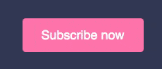
This configuration should look like this:

We can also add more space to the top margin (ex. 30px) of the grid containing the CTA to make it more visible.
Now, adjust the main grid containing our images and texts. To align the images in the right column correctly, tell the right column to Fit content (Behaviour property).
WARNING
If the image shrinks, try to clear the height property from the Style Manager and only update the width.
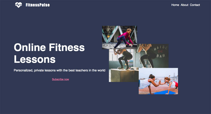
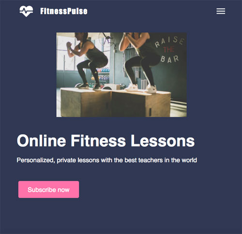
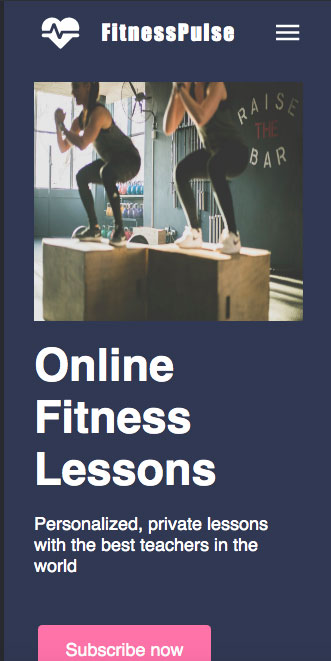
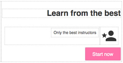
The header should now look like this:
Our next step will be to make sure our design is responsive on mobile.
# Responsive design
By default, Grapedrop's blocks are all made with responsiveness in mind, so most of them adapt automatically to changes in screen size. However, since Grapedrop also allows a high level of layout customization, some manual changes are still required. Keep this in mind and make sure to double-check your design’s responsiveness.
Start by switching to the Tablet view.

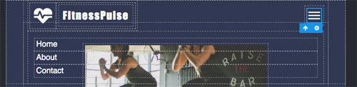
It will look like this:
As you can see, there is something wrong with our logo. This error happens to all the grid blocks because the Allow multiline property is enabled by default on smaller devices. Thus, each column will fill all of the rows. To fix this, simply change the Allow multiline to No.

Additionally, the images are overlapping now. So, set the Visibility property (under Layout category) to Hidden on the two floating images and then resize the middle one. After resizing, you will probably notice the column containing the image is attached to the left side. To fix this, select its grid and change Horizontal Align to Center.
TIP
If you want to change the horizontal alignment of your column, without affecting all others (as we did above), you can change the margins to auto on the side you would like to move. For the case above, you can centre the column by setting the left and right margins to auto.

Additionally, you can select the column containing text and change its Order (under Layout) to 2, which will put it under the image.
You should now see this:
Another issue you might encounter is discovering that the navigation links overlap with the image below when you click on the hamburger menu included in the Navbar block.
This issue occurs because we detached the navbar from the standard flow (via its Position property in Settings), and this makes other elements below unable to respond to its dimensions. So, change the navbar background with the same colour as the section.
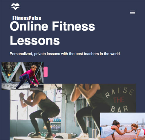
Now let us switch over to the Mobile view
Due to the responsive nature of our design, many of the changes we just did have carried over. So, most of the work is already done! But, we can still improve a few things like hiding the last image (as we did before) and decreasing the size of the heading text (ex. 40px).
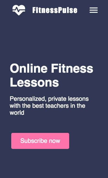
The final result for mobile devices will look like this:
Now that you have completed the header section, you are all set for the next part of this tutorial. This section will detail the key points of our product by utilizing an image and an adjacent features list. We will continue using our Basic Blocks set and will see how to use Classes to make our styles reusable.
# Shared styles with Classes
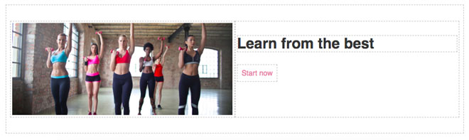
We will begin by defining the structure of our new section. First, drop a new Section block below our header and place a Grid inside of it. Start by removing one of the columns from the Grid, so we have two of them. In the left column, insert an Image Box (similar to Image, but the image will fit dynamically to the size of the block) and choose something from the Image Manager. In the right column, drop a Header block (insert a text of your choice), and place a simple Link below.
The result should look like this:
To introduce you to Classes, we are going to reuse the same styles we applied to the CTA button in the header's Link block.
You can find the Class viewer in the right sidebar of the editor, right above the Style Manager's properties.
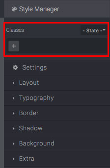
This panel will show you all the classes assigned to the selected block and all the common classes between selected blocks. There is also a dropdown menu with States (we will use them later) and the "+" (Plus) button for adding classes to selected blocks.
Select our CTA link (from the header section), click on the "+" button, write the name of the new Class, and press ↵ (Enter). This how the viewer will change:

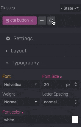
You can now see the newly created class button, which you can edit by double-clicking on the name or remove it by clicking its "x" button.
Another important element added to the viewer is the Sync button  . If you can see it, it means the selected block has styles you can transfer to the current classes. Indeed, if you click the Sync button, it will disappear. You may notice the status change of previously modified properties: they become yellow; this means they are not part of the selected block anymore but are inherited from some parent block.
Now that we have added CTA styles to the class, we can apply the class's properties on other blocks. Select the Link we recently added (the one currently without classes), click on the "+" button, type the same name of the class (cta button), and press ↵ (Enter). This process is how you use Classes to share styles.

Keep in mind that updating the style properties of a block containing classes will only update that selected block. However, when you click the Sync button, the editor will transfer styles from the block to the class, and all the blocks containing that particular class will update accordingly.
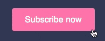
One common design pattern you might see with CTA buttons is that they change their style when you mouse over them. This is where States come in handy. Let us see how they work.
Select one of our CTA buttons, change the State dropdown to Hover and you can see its border change colour -- this indicates that you are editing with an active State. Now we can update the style properties. Change the Fill color (under Background) to #e16a93 and you will see it exclusively applied to the selected block. You might also notice that the Sync button has appeared again and, as we want this effect applied to all of our CTAs, we need to click on the Sync button. After it syncs, if you have finished applying styles, remember to return to the default State.
You might notice the colour change does not look as pleasant as you had wanted. This is because we did not apply any Transition to the link block. To do so, keep the CTA selected (in the default State), open the Extra category in the Style Manager, and add a new Transition layer (Plus icon). Here you specify what type of property you want to animate (choose one from the list or All if you cannot see the property you want in the list), the duration of the transition in seconds, and the easing function to apply. For our purpose, we will set the Background color as a property, 0.2 seconds to the duration, and leave the default ease as an easing function.

Once applied, remember to Sync your styles to apply them to all CTA buttons. It should look like this:
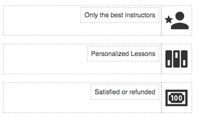
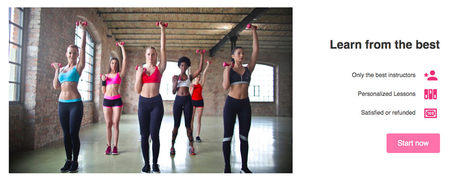
Now, let us go back to our section because we need to write some key features about our product and, just like before, we are going to keep using basic blocks.
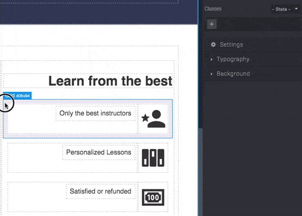
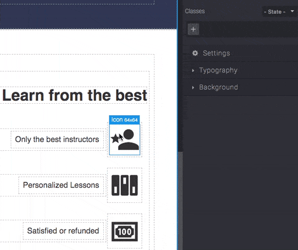
Start by dragging a new Grid block under the Header text (keep two columns). In the right column, place an Icon (select an icon of your choice), and in the left column, insert a Text block. Make the column containing the Icon Fit content (as Behaviour). Also, select the right column containing all the texts (header, the new grid, and link) and set the Text align (under Typography) to right.
The grid, in which we have placed an Icon and Text, will be our feature line; and, as we want three lines, select and copy it two times. Update those copies with a new Text and Icon.
The point of leaving these three feature lines unstyled is to show you how you can speed up your work by using Multiple Selection. To select multiple blocks, start by selecting the first one and then pressing CTRL. You can select other blocks one-by-one or, if those blocks are children of the same parent, you can select the first one (ex. the one on the top), press ⇧ and select the last one (ex. the one on the bottom), and this will also select all blocks in the middle.
With Multiple Selection enabled you can style all of your blocks at the same time — the same is true for adding/removing Classes.
As you can see, from the video above, we selected our three grids, styled them, applied a new Class, and clicked the Sync button to transfer styles from blocks to the Class. The same could be done by focusing on one block, transferring its styles to the class, and then applying that class to other blocks. However, that is likely going to be much more tedious.
We can reduce the height of our grids by removing their padding and setting Min height to auto.
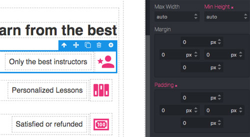
After those changes are applied to a grid containing a class, we can Sync them with that Class. We will also add a bit of space to the top margin of the link below (ex. 30px) and increase the bottom margin on the heading text (ex. 30/40px) to give our features more visibility.
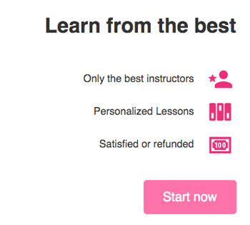
We will now move to the left side of our section. As we did not use that much space with texts, we can give our image more emphasis. So, select the Image and enter 450px as its Height. Since we used an Image Box block, we do not need to worry about sizing it properly as it will adapt automatically. Thus, we can leave the width as being relative to the other column. Select the right column and make its Max width 400px, and set its Vertical Align to center.
To complete this section, check the responsiveness of the design on smaller screen sizes as we did before (remember that Grid goes in multi-line by default) to obtain a similar result.
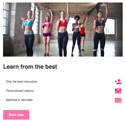
In the tablet view, we reduced the Height of the image to 300px, added 100% value to the Max width property of the column containing our features, and changed its Text align to left. Additionally, disable the multiline on feature lines (remember to sync styles to apply them to the current class).
In the mobile view, we only changed the Height of the image (180px) and the Font size of the header text (30px).
In this part of our tutorial, we introduced the usage of Classes for sharing styles. In the next part, we will see how we can save and reuse Custom blocks.
# Custom blocks
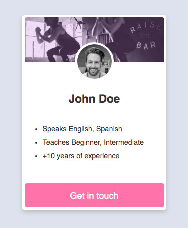
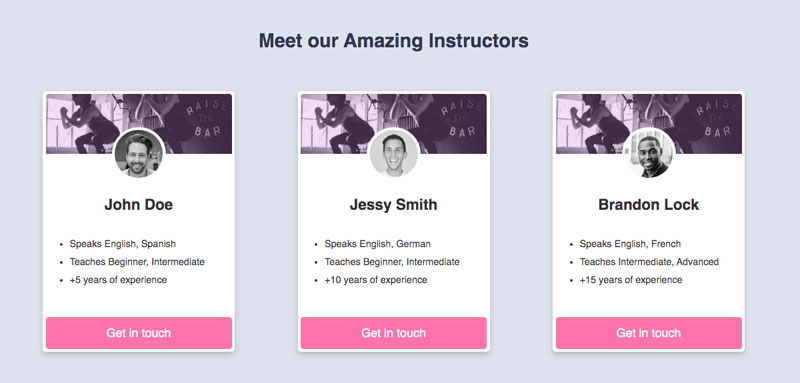
We will begin by describing the available instructors by creating a card for each of them containing valuable information.
Start by dragging a new Section block into the canvas and assign its Fill color to something that would help the user to distinguish it from the previous sections (ex. #dde2ed). Now drop a Header (add any text as a section description) and a Grid that will contain our cards. Align the Header text to the center (Text Align property in Typography) and set its Font color to #303a52.

Now we can start creating the card. Again, we can use the Box block as the main wrapper. So, drop a Box block into one of our columns and style it with these properties:
- Fill color: white
- Border radius: 5px (all corners)
- Box shadow: Offset Y 5px, Blur 10px, Fill color: #bbb

Insert the following blocks into the card: an Image box, a Grid, Header, and Text. Then, in the Grid, put an Image block inside the middle column and, under the Text, copy one of our CTAs. You should see this:
For the Image box, choose any image and set the Height to 100px. For the Image placed in the grid, choose the instructor profile image (though any image would do). Then, set the Border radius to 100% (this will round off every corner and form a circle), and the Border to 5px solid white (Width, Style, Fill color).
TIP
If the chosen image for the profile does not initially have the shape of a square (the same width and height), then you will likely see an oval instead of a circle. Unfortunately, manually changing the sizes of the image will not help, as you will get a stretched result. So, we suggest switching the Image block with the Image box (this will avoid stretching the image).
Now, you can use a margin trick to raise our image. Select the grid and change its top Margin to -50px: this will not only bring up the grid but also all the blocks below it.

To make the image look centred on mobile, make all the columns Fit the content; then centre them using Horizontal Align in Grid and add a fixed Width to the Image (ex. 100px).
In the next step, we can update the Header with the name of the instructor and the Text block with some additional information. For styling, place the Header in the center (using Text align property) and reduce its Font size (eg. 25px). Update the Text and the CTA Width to 100%. You can also play around with styling to make it look better (ex. use the same Border radius on top corners of the Image box to be inline with the card container). As the card container will try to take up all available horizontal space, we can limit its width by setting its Max Width to something like 320px. So far, you should have this:
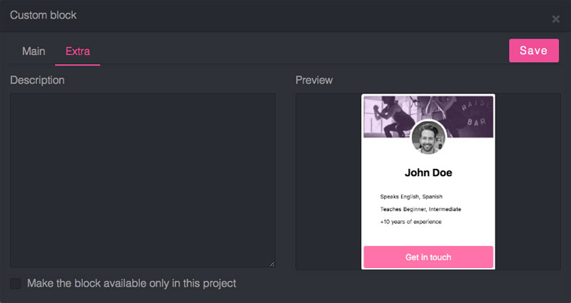
Now we can create our first Custom block. To bring up the custom block model, select a block (in this instance, the card container) and press CTRL + K or choose the Create block from the toolbar setting.

From the modal window, you can see the code of the block and its preview. If needed, you can edit the code before saving and see its changes in the preview below.
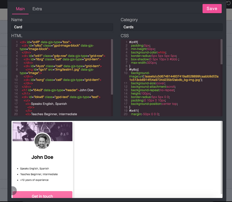
In the Extra tab, you can also add a description, upload a different preview, and decide whether to make the block available for other projects or only this project.
TIP
If you update the code and want to remake the preview screenshot, you can select the action in the bottom left corner of the preview container.

Once saved, you will see the block under the Custom blocks category. You can edit it (on mouseover, click on the pencil icon in the bottom right corner) and drop it in the canvas like any other block.

TIP
Mixing Custom Blocks with Classes may also help with creating highly scalable templates.
Now we can drag our Card block in the remaining columns of the grid and update their content. To centre them correctly, make the columns Fit content and then change the Horizontal Align of the grid to Space between (4th option).
If you try to switch to the Tablet view, this is what you will likely see:
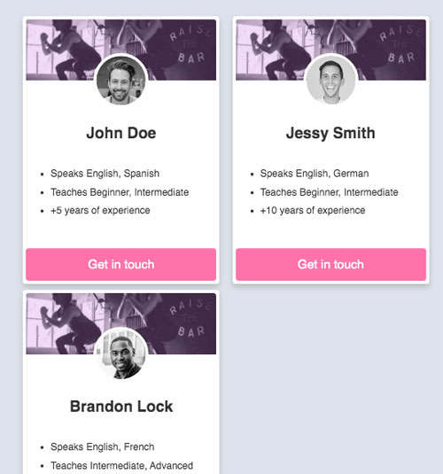
The grid is behaving correctly, but we need to move all of the cards in the centre into a new row. You could try different approaches, but the fastest method is changing the direction of the grid from Row (default value) to Column and changing the Horizontal Align to center (changing direction changes some grid properties).

You can also add some margin to columns (ex. margin-bottom to 20px). By now, you should have this:
In the next part of this tutorial, we will create a simple subscription form and learn how to check the data we collect.
# Forms
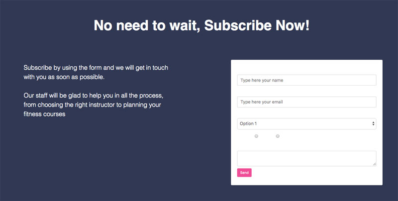
Start by dropping a new Section block into the canvas, and assign the same background and typography colour of the Header section. Inside the section, place a heading block and, below that block, drop a grid with two columns. In the left column, add Text, and, in the right column, drop a Form block (Forms sub-category in Basic Blocks). Change the text and style them however you like. Finally, update the size of the columns to give them more space (ex. set Max Width value to 500px and Horizontal Align of the grid to Space between).
WARNING
You can also drop other Forms blocks (Input, Select, etc.), but only inside a Form wrapper (even an empty one is fine).
You may notice that the text inside the form wrapper is not visible. This invisibility occurs because the container lacks an explicit color; thus, it inherits a color from the section and blends into it. Therefore, we need to change the background colour from white to rgba(0,0,0,0.2) (which means black with 0.2 of opacity).
Remove the part containing the Message and Gender in the Form, and update the style of the button by replacing its default class with a CTA button (if you see a white border around the button, you can remove it via the Border property). You can also add more space to the Send button by updating the padding of its container (Form group). It should now look similar to this:
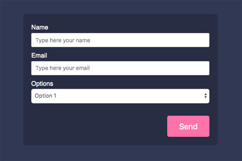
When selecting input blocks, you might see different properties under Settings. Make the properties all required, change the Options name to Level, and update its options list with these values: Beginner, Intermediate, Advanced (one per row).
WARNING
Be sure to have inputs with unique Name properties in each form to avoid confusion.

Our inputs are now ready, so select the Form and check its properties.

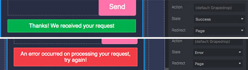
The Name is not mandatory for the form, but it might be helpful when you check the collected data, so call it Subscription for now. The Method tells the browser how to send the data. If you do not know how to use it yet, leave it as POST. In Action, you specify the URL (where to send the data). For collecting data on Grapedrop, leave it as it is (empty). The State property allows you to customize the message for both a success and an error (ex. the user lost the internet connection) when utilizing the form submit.
The Redirect property allows you to send your users to another page/URL once they have successfully submitted the form.
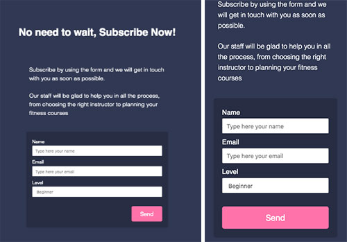
As always, check the section on different devices and make the appropriate changes.
To test your form, click on the Preview button (eye icon), which will open your page in a new tab, fill out the form, and press Send. Now, go back to the editor and check the data. To see all the collected records, open the page settings from the Pages panel (point the mouse over the page layer and click on the gear icon), and go to the Forms tab.

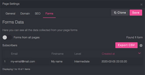
Here you can see all the future records collected on the landing page, export the data (available from the Basic plan), and do other generic operations to manage records (check the top-right Gear button).
# Publish
Once the design of the page is finished, we can finally publish it online.
This can be achieved in the editor. First, decide where you would like to make it available. Then, go to the page settings and click the Domain tab.
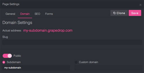
Make sure to have the Public switch turned on. Then, you can choose to use the Subdomain or a Custom domain. You can also specify a slug for the page. Now Save your changes and close the window.
TIP
We also highly recommend checking out the General and SEO tabs to increase the potential outreach of the page.
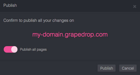
The last step is publishing your content! Click on the Publish button and confirm.

Congratulations! Your page is online, and you have learned the basics of the Grapedrop platform. Now you are ready to create your next successful project 💪